Minimalist Business Cards
Why Minimalist Business Cards Are a Game-Changer for Modern Brands
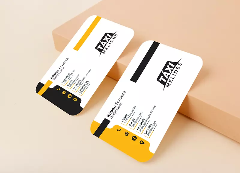
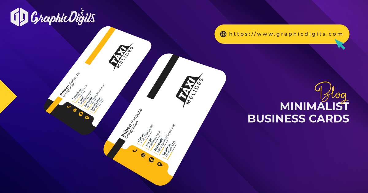
In today’s fast-paced digital world, where first impressions are vital, Minimalist Business Cards offer a fresh and modern approach for brands looking to stand out. The less-is-more philosophy of minimalist design cuts through the noise, focusing on clean lines, ample white space, and only essential details. This approach creates a visually appealing card and delivers a clear, professional message about your brand.
Minimalist Business Cards are particularly effective because they emphasize simplicity and elegance. By avoiding clutter, these cards make the most important elements—like your name, logo, and contact information—easy to spot and remember. This clarity reflects positively on your brand, conveying confidence and sophistication.
Another benefit of minimalist designs is their versatility. Whether you are in tech, consulting, or the creative industry, minimalist business cards offer a timeless look that aligns with Modern Branding. Their sleek design complements any brand aesthetic, making them ideal for businesses of all sizes.
In addition, opting for a Minimalist Card Design allows brands to focus on quality materials, like premium paper or subtle textures, further enhancing the card’s appeal. This attention to detail can leave a lasting impression, setting your brand apart from the competition.
Ultimately, Minimalist Business Cards are a game-changer for modern brands because they communicate professionalism and style while being practical and easy to read. If you want your business card to make a powerful statement with minimal effort, a minimalist approach is the way.
Top Design Elements for Eye-Catching Minimalist Business Cards
Minimalist business cards may embrace simplicity, but that doesn’t mean they lack design elements that make them stand out. Carefully chosen design elements can elevate a minimalist business card, leaving a lasting impression on anyone who receives it.
One of the most critical design elements for minimalist cards is white space. White or negative space gives the design breathing room, making the card easy to read and more visually appealing. It creates balance and focuses attention on essential information like your name, logo, and contact details.
Another critical element is typography. Choosing a clean, modern font is crucial for minimalist designs. Sans-serif fonts are often preferred because of their simple and sleek appearance, which complements the overall design philosophy. The font size and spacing also matter; they should enhance readability while keeping the card uncluttered.
Incorporating subtle textures or finishes, like matte or glossy finishes, can add sophistication to the card without overwhelming the minimalist design. Embossing or debossing your logo is another great way to add texture and dimension without sacrificing simplicity.
Lastly, colour plays a significant role in minimalist business cards. While minimalist designs often lean toward neutral tones like black, white, or grey, adding a pop of colour through a logo or accent line can make the card more memorable. The key is to keep the colour palette simple and cohesive.
By focusing on these design elements—white space, typography, texture, and colour—you can create an eye-catching minimalist business card that makes a strong impact while staying true to the simplicity of the design.
MAKE AN APPOINTMENT
Elevate your brand with minimalist business cards designed to make a lasting impression. At Graphic Digits, we specialize in creating custom business cards that reflect your unique brand identity through thoughtful stationery design. Whether you’re looking for simple elegance or a bold statement, our team will work with you to create cards that stand out.
Contact us today to schedule an appointment and start designing minimalist business cards that speak volumes about your business. Let’s create something memorable together!

How to Choose the Right Fonts for Your Minimalist Business Card
When it comes to minimalist business cards, choosing the right font is essential to achieving a sleek and professional look. Your font will influence the card’s readability and reflect your brand’s personality. Here’s how to choose the best font for your minimalist business card.
First, opt for clean and simple fonts. Sans-serif fonts are often the go-to choice for minimalist designs because they have a modern and unembellished look. Popular fonts like Helvetica, Arial, and Open Sans provide a crisp, clear aesthetic that aligns well with minimalist principles.
The font size is also essential. Keep it large enough to be readable without straining the eyes, but avoid making it so large that it overpowers the design. Typically, a font size of 10-12 points works well for business cards.
Consider the spacing between letters, also known as kerning. Proper kerning ensures that the text looks balanced and is easy to read. In minimalist design, every element must have room to breathe, so ensure the text spacing is neither too tight nor too loose.
It’s essential to consider the contrast between the font and the background carefully. For example, a dark font on a light background (or vice versa) ensures readability while maintaining a minimalist aesthetic. Avoid using too many fonts on one card; stick to one or two complementary fonts to keep a clean and cohesive look.
By selecting clear, legible fonts and paying attention to size, spacing, and contrast, you can create a minimalist business card that looks professional, modern, and aligned with your brand’s identity.
The Benefits of White Space in Minimalist Business Card Design
White space, also known as negative space, is one of the most essential principles of minimalist business card design. It can transform an ordinary card into something elegant, professional, and impactful when used correctly.
One key benefit of white space is that it enhances readability. Giving text and design elements room to breathe makes it easier for people to absorb the information on the card. This is especially important in business cards, where contact details must be immediately apparent. With ample white space, your name, logo, and contact information will stand out without being overshadowed by other design elements.
Another advantage of white space is that it conveys a sense of sophistication and simplicity. Minimalist designs are known for their clean, uncluttered look; white space is critical in achieving this. By avoiding overloading the card with too much information or imagery, you create a balanced, aesthetically pleasing design that feels professional and modern.
White space also allows the card to leave a lasting impression. A cluttered design can feel overwhelming and forgettable, whereas a minimalist card with sufficient white space is more likely to be remembered for its sleek and polished look.
Lastly, white space can draw attention to specific elements of your business card. If you want your logo or company name to be the focal point, surrounding it with white space will naturally direct the viewer’s eyes toward it.
Incorporating white space into your business card design effectively creates a clean, professional, and visually appealing card that leaves a lasting impression.
Minimalist Business Cards: Less Is More in Professional Design
The phrase “less is more” rings especially true regarding minimalist business cards. In today’s competitive marketplace, a card that embraces simplicity and clarity often stands out more than one with excessive details. Here’s why the minimalist approach works so well in professional design.
First, minimalist business cards emphasize clarity. Removing unnecessary elements allows the most critical information—your name, company, and contact details—to take center stage. This makes your card easy to read and ensures recipients can quickly identify who you are and how to contact you.
A clean, minimal design also reflects professionalism. It shows that your brand is organized, modern, and confident enough to let the essentials speak for themselves. This can be far more effective in a business context than a cluttered, overly decorated card.
Additionally, minimalist business cards tend to have a longer shelf life. While trendy designs may go out of style, a simple and elegant card will remain relevant for years. Its timelessness is part of what makes minimalism so effective in professional settings.
Another benefit of minimalist design is that it allows you to focus on quality. By keeping the design simple, you can invest in premium materials like high-quality paper or special finishes that elevate the overall feel of the card.
Ultimately, minimalist business cards prove that less truly is more. They allow you to make a lasting impression with simplicity, clarity, and timeless style.
Choosing the Perfect Color Palette for Minimalist Business Cards
Selecting the right colour palette for your minimalist business cards is crucial to ensuring they make a lasting impression. Colours can convey emotions, reflect your brand identity, and influence how people perceive your professionalism. Here’s how to choose the perfect colour scheme for your minimalist design.
First, consider your brand identity. The colours you choose should resonate with your brand’s personality. For example, bright, bold colours can convey that energy if your brand is about innovation and creativity. Conversely, softer, muted tones may better represent your professionalism if you’re in a more traditional industry.
Next, keep the palette simple. Minimalism thrives on simplicity, so opt for two to three colours at most. This allows you to maintain a clean and uncluttered look while providing enough contrast to highlight essential elements like your name and contact information. A common approach is selecting one dominant colour and one or two accent colours complementing it.
Remember colour psychology. Different colours evoke different feelings; for instance, blue is often associated with trust and reliability, while green can symbolize growth and harmony. Choosing colours that align with the message you want to convey can enhance your business card’s impact.
Lastly, consider the card’s finish and material when selecting colors. Matte finishes can soften hues, while glossy finishes can intensify them. Testing your chosen colours on the specific card stock you plan to use can help ensure they translate well in print.
By thoughtfully selecting a colour palette that reflects your brand, keeps it simple, and considers colour psychology, your minimalist business card will effectively communicate your professionalism and style.
Why Simplicity Works: The Psychology Behind Minimalist Business Cards
In a world filled with distractions, simplicity stands out. Minimalist business cards embody this principle, utilizing straightforward designs to create a memorable impact. Understanding the psychology behind minimalist design can help you leverage its power for your brand.
At the core of minimalist design is the concept of clarity. A clean and uncomplicated layout makes it easier for recipients to absorb information quickly. When information is presented simply, people are more likely to remember it. This is especially important in a business context, where you want to ensure your name and contact details linger in the minds of potential clients or collaborators.
Another psychological factor is the use of white space. White or negative space provides visual breathing room, allowing the viewer’s eye to rest. This enhances readability and draws attention to key elements, such as your logo or name, creating a focal point that stands out.
Furthermore, minimalist business cards can convey a sense of professionalism and confidence. By stripping away unnecessary embellishments, you signal that you value quality over quantity. This focus on the essentials can instil trust in recipients, reinforcing that you are a serious and reliable professional.
Lastly, simplicity often resonates with modern aesthetics, appealing to contemporary sensibilities. A minimalist card aligns perfectly with these values in an era where consumers appreciate brands that prioritize efficiency and clarity.
In summary, the effectiveness of minimalist business cards lies in their psychological impact. You can create a powerful tool that leaves a lasting impression by utilizing clarity, white space, professionalism, and modern aesthetics.
How to Make Your Logo Shine on a Minimalist Business Card
Your logo is the visual cornerstone of your brand, and making it shine is essential when it comes to minimalist business cards. A well-placed and thoughtfully designed logo can create an immediate connection with your audience. Here’s how to ensure your logo stands out in a minimalist design.
First, consider the size and placement of your logo. It should be prominent but not overwhelming. A common approach is to position the logo at the top or centre of the card, making it the focal point. Ensure it has enough white space around it to enhance its visibility and prevent it from feeling crowded.
Next, use colour strategically. If your logo incorporates multiple colours, consider using a monochromatic palette for the card. This helps the logo stand out while keeping the overall design cohesive. Alternatively, if your logo is a single colour, choose contrasting colours for the background to create visual interest and highlight your brand identity.
The choice of material also plays a crucial role. High-quality card stock can elevate the look of your logo, giving it a more professional feel. Finances like embossing or foiling can add texture and depth, making your logo pop even more.
Lastly, ensure that the logo is high-resolution. A blurry or pixelated logo can undermine the professionalism of your card. Always use vector files for printing to maintain the quality and integrity of your logo.
By focusing on size, placement, colour, material, and resolution, you can create a minimalist business card that makes your logo shine, effectively showcasing your brand to potential clients and partners.
Best Paper Choices for Minimalist Business Cards
Choosing the right paper for your minimalist business cards can significantly impact their overall impression. The feel, weight, and finish of the card all contribute to how your brand is perceived. Here are some of the best paper choices for a minimalist design.
First, opt for a thicker card stock. A weight of at least 14 pt (or 300 GSM) provides a sturdy feel, making your business card appear more professional and durable. A thicker card also holds up better over time, ensuring it remains in good condition as it’s handed out.
Next, consider the finish. Matte finishes are popular for minimalist designs, creating a soft, sophisticated look. They allow easy writing on the card, making them practical for jotting down additional contact information. On the other hand, glossy finishes can enhance colour vibrancy, giving your card a polished and modern appearance. However, they can sometimes reflect light, making text more challenging to read.
Another option is textured paper, which can add a unique tactile element without overwhelming the minimalist aesthetic. Textured finishes, like linen or uncoated stocks, can create an elegant feel while keeping the design simple and clean.
Recycled or eco-friendly papers are also worth considering, especially if your brand values sustainability. Many recycled stocks offer excellent print quality while promoting your commitment to environmental responsibility.
By selecting the right paper—thicker stock, appropriate finishes, and even eco-friendly options—you can enhance the overall impact of your minimalist business cards and ensure they leave a lasting impression.
Avoiding Common Mistakes in Minimalist Business Card Design
Creating minimalist business cards is an art that requires careful consideration and planning. While simplicity is key, some common mistakes can undermine your design’s effectiveness. Here’s how to avoid these pitfalls and create a standout minimalist business card.
One of the most frequent mistakes is overcrowding the card with information. In minimalist design, less is more. Stick to the essentials—your name, job title, contact details, and logo. Avoid adding unnecessary elements like multiple phone numbers or social media links. This can lead to a cluttered appearance that detracts from your message.
Another standard error is poor typography choices. In minimalist designs, the choice of font is crucial. Select clean, legible fonts that reflect your brand’s personality. Avoid using too many different fonts, as this can create visual chaos. Stick to one or two complementary fonts to maintain a cohesive look.
Colour misuse can also hinder your design. While using bright or numerous colours may be tempting, a minimalist card benefits from a limited colour palette. Choose a primary and one or two accent colours to create harmony and maintain clarity.
Furthermore, neglecting to incorporate enough white space can make your card feel overwhelming. White space is essential in minimalist design, as it allows elements to breathe and enhances readability. Make sure to leave ample margins and spacing between text and design elements.
Lastly, ensure that your logo is high-resolution and appropriately sized. A blurry or pixelated logo can diminish the professionalism of your card. Always use vector files for printing to maintain clarity.
By avoiding these common mistakes—information overload, poor typography, misuse of colour, inadequate white space, and low-quality logos—you can create a minimalist business card that effectively communicates your brand’s identity and leaves a lasting impression.


