Poster Design Ideas
Creative Poster Design Ideas to Capture Attention
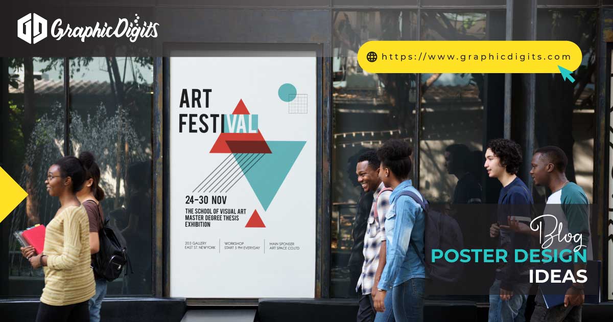
Creating eye-catching posters requires creativity, strategy, and design skills. Whether you’re promoting a product, event, or service, using unique poster design ideas can significantly improve engagement. The first step is choosing a bold and engaging headline. A powerful, attention-grabbing title sets the tone for your poster. Combine it with vibrant colours and high-quality images to evoke emotion and interest.
For example, consider using contrasting colours to make key elements stand out or experiment with modern typography to create a dynamic feel.
Another approach is incorporating creative layouts that deviate from the traditional. A mix of vertical and horizontal elements can draw the viewer’s eyes across the poster. Think creatively using negative space, allowing essential details to breathe and stand out. Minimalist designs, with only a few key pieces of information, are often more effective than cluttered posters.
For events or sales, include a clear call to action (CTA) to encourage immediate action. Phrases like “Get Your Tickets Now” or “Shop Today and Save” can create a sense of urgency. Don’t forget the importance of your brand’s identity. The poster design ideas should align with your brand style, incorporating elements like your logo, colours, and fonts.
At Graphic Digits, we specialize in helping clients create innovative and visually compelling poster design ideas that truly capture attention. Let us bring your vision to life with designs that speak to your target audience and make a lasting impression.
Top Tips for the Perfect Design of Poster
A well-designed poster communicates its Message quickly and effectively. Whether you’re advertising an event, sale, or brand, the design of the poster plays a crucial role in catching the viewer’s attention. Here are some top tips to help you create the perfect poster design.
Keep It Simple: Simplicity is key to effective poster design ideas. A cluttered poster can overwhelm the viewer and distract from your Message. Focus on key elements—headline, visuals, and call to action.
Use High-Quality Images: Images are a focal point of any poster. Use high-resolution visuals that are relevant to your Message. Poor-quality images can detract from the overall professional look of your design.
Choose Bold, Readable Fonts: Your text should be easy to read at a distance. Avoid using too many fonts; stick to one or two that complement each other. Make your headline large and bold to capture attention, and keep the body text concise.
Balance Your Elements: Ensure your design has a balanced layout. Use white space effectively to prevent the poster from feeling overcrowded. Arrange your visuals, text, and logos in a way that guides the viewer’s eyes naturally.
Add a Clear Call to Action: Every poster should tell the viewer what to do next. Whether buying tickets, visiting a website, or following on social media, make sure the call to action is clear and prominent.
Graphic Digits offers expert services to help you create the perfect poster design. Whether for marketing, events, or branding, we ensure your design leaves a lasting impression.

Innovative Poster Design Ideas for Every Occasion
Originality can set your design apart when creating effective posters. There are countless poster design ideas that you can implement depending on the occasion, but it’s essential to ensure your design speaks to the intended audience. Here are some innovative design ideas to inspire your next project.
Interactive Designs: Incorporate QR codes or scannable elements to engage the audience further. This approach works exceptionally well for events or promotions. People can scan the code to access additional information or discounts.
Typography-Based Designs: Use creative typography as the primary design element. Play with font sizes, shapes, and colours to create a visually dynamic composition. This approach can be very striking for minimalist posters.
3D Elements: Integrating 3D design elements into your poster can add depth and intrigue. This approach works great for product promotions or exhibitions.
Vintage or Retro Styles: Vintage design is making a comeback. Use old-school typography, muted colours, and retro graphics to give your poster a nostalgic, timeless feel.
Illustrations and Custom Art: Rather than using stock images, create custom illustrations that match the theme of your event or product. Hand-drawn elements or digital art can add a unique, personal touch to your poster.
At Graphic Digits, we provide cutting-edge poster design ideas tailored to suit any occasion. Let us help you craft innovative designs that grab attention and leave a lasting impact.
How to Choose the Right Design of Poster for Your Brand
Selecting the right poster design ideas for your brand is a critical decision. Your poster communicates your Message and reflects your brand’s identity. Follow these steps to ensure your poster aligns with your brand’s goals.
Understand Your Brand’s Identity: Before you begin designing, take a moment to define your brand’s personality. Are you playful, professional, or luxurious? Your poster design ideas should be consistent with these traits. Use brand colours, fonts, and imagery that align with your established style guide.
Know Your Audience: Consider who will be viewing your poster. Is your target audience young and trendy, or do they prefer a more traditional approach? Tailor your design to appeal to their preferences. For example, younger audiences may appreciate bold, minimalist designs, while older demographics may respond better to more detailed or classic layouts.
Choose a Relevant Visual Style: Your design should reflect the nature of your brand. Sleek, modern visuals work well for a tech company. Natural imagery with earthy tones might be more appropriate for an organic food brand. Aligning your visuals with your brand’s Message ensures consistency.
Keep the Message Clear: Your poster should convey a single message. It should focus on one objective, whether promoting a new product, an event, or a sale. Avoid clutter and ensure your poster design emphasizes the key information.
Graphic Digits specializes in creating poster design ideas that capture your brand’s essence and engage your target audience. Let us help you craft a poster that aligns perfectly with your brand’s identity.
Practical Poster Design Ideas to Boost Your Marketing Campaign
Posters remain among the most effective marketing tools for businesses looking to grab attention and drive action. Whether promoting an event, sale, or product launch, utilizing the right poster design ideas can significantly boost your marketing campaign. Here are some strategies to ensure your poster stands out.
Bold, Eye-Catching Headlines: Your headline should be the first thing people notice. Use a bold, impactful font and keep it short yet informative. A strong headline can capture attention immediately, drawing people in to learn more.
Incorporate a Call to Action: Include a clear call to action (CTA). Whether it’s “Shop Now,” “Sign Up Today,” or “Join Us,” a strong CTA encourages immediate action from your audience.
Use Visual Hierarchy: Organize your poster to guide the viewer’s eyes from top to bottom naturally. Place the most essential information in prominent positions, like the headline and CTA. Use colour contrasts and font sizes to create emphasis.
Include Social Proof: Testimonials, ratings, or customer reviews can motivate potential customers. Adding social proof helps build trust and persuades viewers to engage with your brand.
Ensure Brand Consistency: Keep your poster design ideas consistent with other marketing materials. Use your brand’s colour scheme, logo, and fonts to create a cohesive look that reinforces your brand identity.
At Graphic Digits, we create poster design ideas that align with your marketing goals. Our custom designs are tailored to boost engagement, create lasting impressions, and drive results.
Understanding the Key Elements in the Design of Poster
Creating an effective poster involves more than just putting text and images together. To ensure your design resonates with your audience, it’s crucial to understand the key elements of poster design. Here’s a breakdown of what you must consider when designing your next poster.
Headline: Your headline should be bold and easy to read, grabbing attention immediately. It’s the first thing people see, so make it impactful and relevant to the Message.
Visuals and Imagery: Images are powerful tools in poster design ideas. They should complement your Message and capture the viewer’s attention. Whether you use illustrations, photographs, or graphics, ensure they align with your brand and evoke the right emotions.
Typography: Fonts play a crucial role in your design. Choose fonts that are easy to read and suit the tone of your Message. Use a mix of sizes to create a hierarchy, with the headline being the most significant element on the poster.
Colours: Colors set the tone and mood of your poster. Bright colours convey energy and excitement, while muted tones evoke sophistication. Choose colours that reflect your brand and appeal to your target audience.
Call to Action (CTA): A clear CTA prompts viewers to take the next step, whether visiting your website or purchasing a product. Make it prominent and actionable.
At Graphic Digits, we help you create well-balanced, effective poster designs that combine these elements to create visually engaging, high-impact results.
Poster Design Ideas: How to Make Your Message Stand Out
Making your Message stand out in a sea of advertisements requires strategic and creative poster design ideas. Whether you’re promoting an event, sale, or service, it’s crucial that your poster catches the viewer’s eye and effectively communicates your Message. Here’s how to make it happen:
Use Bold Colors: Bright, contrasting colours help make your Message stand out. Consider using complementary colour schemes to create visual interest and highlight key elements.
Limit Your Text: Keep your Message clear and concise. Avoid overwhelming the viewer with too much text. Focus on one core idea and communicate it effectively with as few words as possible.
Dynamic Layouts: Break free from traditional layouts and experiment with asymmetry or diagonal lines. This can make your design feel fresh and engaging, unexpectedly guiding the viewer’s eye across the poster.
Visual Focus: Ensure your main Message or image is the focal point of the design. Highlight your core idea by making it larger or more prominent, drawing attention to it first.
Create a Story: Tell a visual story with your design. Use images or graphics to help illustrate the Message. A story-driven design can evoke emotions and help connect with your audience more deeply.
At Graphic Digits, we specialize in creating poster design ideas that make your Message impossible to ignore. Let us help you craft designs that get noticed and leave a lasting impression.
Best Practices for the Design of Posters to Engage Your Audience
Creating an engaging poster involves more than aesthetics—it involves effectively capturing your audience’s attention and motivating them to act. Here are some best practices for designing posters that genuinely engage your audience.
Start with a Strong Headline: Your headline is the first thing people see, so make it robust. Keep it short, direct, and compelling. The headline should immediately convey the Message you want to communicate.
Choose the Right Imagery: Use images that connect with your target audience. Whether it’s a high-quality photograph, graphic, or illustration, your visuals should align with the theme and Message of the poster.
Keep Your Message Clear and Concise: Don’t overload your poster with too much information. Focus on a single message and keep your text minimal. Viewers should be able to quickly grasp the core idea of your poster in just a few seconds.
Emphasize the Call to Action: A strong CTA guides your audience toward the next step. Whether purchasing, attending an event, or signing up, make sure your CTA stands out and is easy to act on.
Ensure Visual Balance: Properly balancing text, images, and negative space is essential for readability. An overcrowded poster will overwhelm the viewer, so ensure enough space around each element.
At Graphic Digits, we use these best practices to create poster designs ideas that engage and inspire action. Let us help you connect with your audience through designs that speak volumes.
Affordable Poster Design Ideas for Small Businesses
Creating an affordable yet effective poster design ideas for small businesses can be a game-changer in attracting new customers. Poster design ideas don’t have to break the bank—many ways exist to design impactful posters on a budget.
Use Templates: Numerous online platforms offer customizable templates that are cost-effective and easy to use. Choose a template that aligns with your brand and customize it with your business details.
Leverage Minimalist Designs: A minimalist approach doesn’t mean boring—it means focusing on the essentials. Using fewer elements, you can create a clean and modern design that grabs attention without going over budget.
DIY Photography: You don’t need a professional photographer for quality images. Use your smartphone to capture high-resolution, well-composed shots that represent your business.
Use Bold Typography: Instead of spending money on complex graphics, use bold, readable typography to convey your Message. A strong font can often communicate more effectively than elaborate images.
Print in Bulk: Once you’ve finalized your design, printing in bulk can lower per-unit costs. Look for local or online printing services that offer discounts for large orders.
At Graphic Digits, we offer affordable poster design ideas for small businesses looking to make a significant impact without breaking the bank. Let us help you create budget-friendly designs that boost your brand’s visibility and attract customers.
The Art of Poster Design: Creative Ideas for Impactful Results
Poster design ideas is an art form that combines creativity, strategy, and storytelling to deliver a message that resonates with viewers. Practical poster design ideas go beyond simply presenting information—they make an emotional impact and inspire action. Here are some creative ideas to consider when crafting your next poster.
Use Color Psychology: Colors influence emotions and behaviors. For example, blue evokes trust, while red creates excitement. Choose colours that align with the emotion you want to convey.
Create Contrast: Using contrasting elements—such as light versus dark or large versus small—helps draw attention to your poster’s essential parts. A bold contrast between background and text can make your message pop.
Incorporate Motion: Use design elements that suggest movement, like arrows or diagonal lines. This can create a sense of dynamism and urgency, prompting viewers to act immediately.
Use Custom Illustrations: Rather than relying on stock images, incorporate custom illustrations or hand-drawn elements to make your design unique. This adds personality and sets your poster apart.
Telling a Story: People remember stories better than static information. Create a narrative with your visuals and text that pulls the viewer in and makes them want to learn more.
At Graphic Digits, we specialize in the art of poster design, creating visually compelling designs that make an impact. Let us help you craft creative designs that leave a lasting impression on your audience.


